The Charts component allows you to create a variety of interactive graphical charts based on tabular data.
This guide requires a user with the Chart Editor role. If you don't have the required role you will not be able to access the features described.Supported Content Types
- Pages
- Articles
Usage
- In your page or article, go to the Main Content Area and select Add Component.
- Scroll down to the Data Visualization section and select the Charts component.
- You'll immediately be able to start adding the data for your chart.
- Preview and save when happy with the results.
Entering Data
Data can be entered manually by typing it into the chart's table or by importing a CSV file.
Keep in mind that the component expects summarized data. The system is NOT able to aggregate, or make calculations based on raw data. For example, you can enter the percentages of different categories, but you wouldn't be able to enter the, possibly thousands, of items from which those percentages are calculated.
Categories by Column or Row
Changing whether Categories are identified by the first Column or Row will change how the data from your table is processed. If your table contains multiple categories, be sure to use the right setting so you can apply colors.
Colors
Choose from the list of colors available.
[Do we need to mention where the current list of colors came from? Or wait until official?]
Import Data from CSV
The component allows you to import your data from a CSV file. This will come in handy if you're dealing with many data points as entering/changing these one at a time can be very inefficient. For example, if you need to change the order of the columns, it will be easier to do this in Excel and re-import than to do it manually in Drupal.
You will want to make sure your CSV file contains only the data and headers you want to import as the contents will be added to the table as they are. See example below:

Some formatting issues may occur with special characters so be sure to review your data and labels after import.
Chart Options
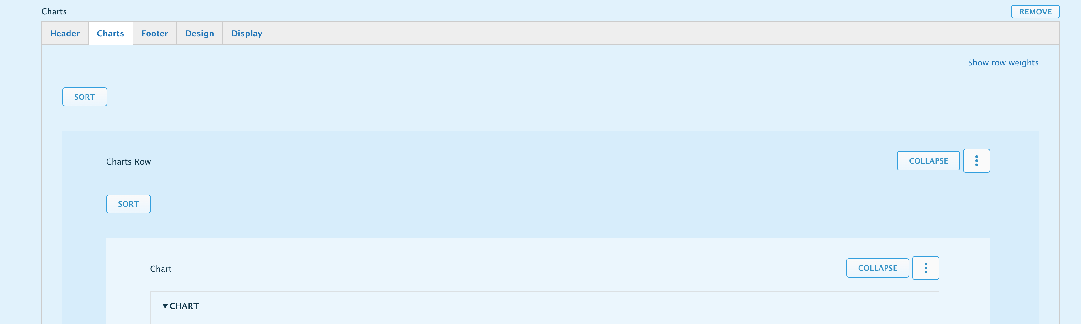
Chart Rows
A single Charts component allows you to add one or more charts at a time. These are organized in rows which will automatically resize them to fit evenly side by side. For example:
- One chart: A charts component, with 1 row, with 1 chart.
- Two charts side by side: A charts component, with 1 row, with 2 charts.
- Four charts on a grid: A charts component, with 2 rows, with 2 charts each.
Of course, these are just examples, many other combinations are possible but how good they look will depend on the charts. Simpler charts will look better when grouped, while a complex chart will be better displayed standalone.
To add a new row, scroll down to the bottom of your Charts component and click the button Add Charts Row.
Text Fields
Additional information can be provided through the following fields
- Chart Title
- Chart Subtitle
- Axis Titles
- Value Prefix and Suffix
- Decimal Count
- Caption
Chart Configuration
- Tooltips - Show data details on mouse over.
- Data Labels - Show data details as labels on chart.
- Data Markers - Show data markers (points) on line charts.
- Legend Position
- Stacking (for bars, columns, and area charts)
- Axis Minimum and Maximum value ranges - Sets the lowest and highest axis value of the chart.
- Secondary Y-axis
Component Options
Like other components, you'll have access to different tabs that will allow you to control other aspects of the content you're creating. These include:
- Header - which has the standard Title and Description field.
- Footer - allows you to add a Footnote. This is identical to the Description field but located after the chart.
- Design - allows you to control spacing and borders before and after the component. This can be handy to present the chart as a standalone piece vs one that flows with the copy of your page.
- Display - allows you to hide or display the component.