The Header is the section at the very top of your pages. It creates the first impression for your visitors. It contains the main headline, an optional subhead, and often an impactful background image.
Header Styles
Depending on your content needs, you can choose between two header styles: Default and Focal.
Default

Focal
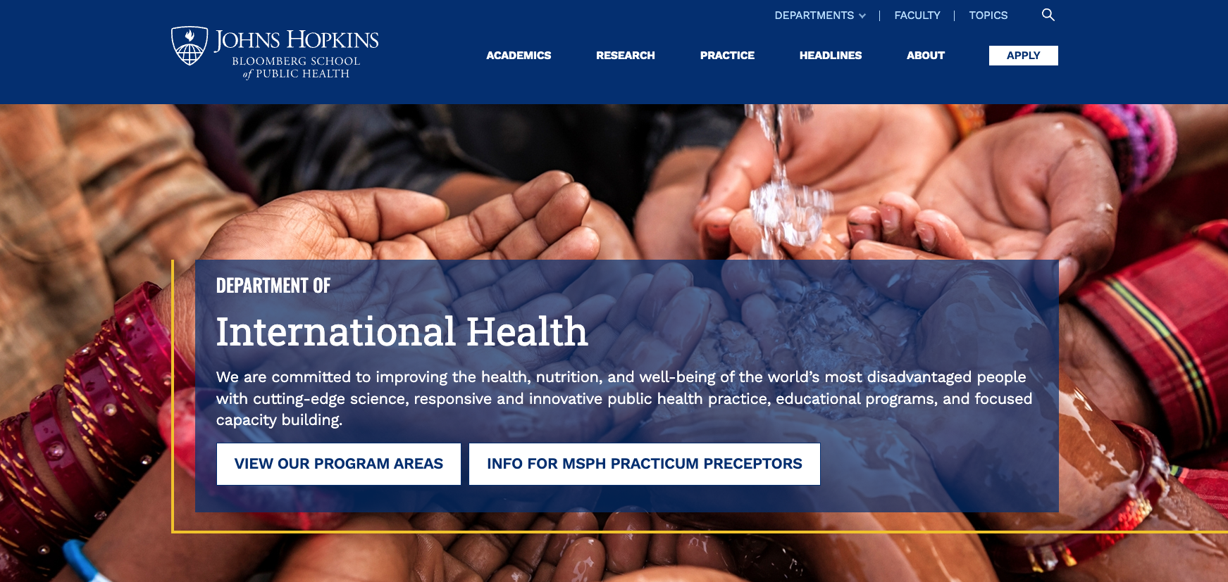
Default Header
The Default Header is best suited for pages where the text is the primary focus. It's best used for high-level landing pages, department homepages, or sections where a large thematic image sets a tone. Default is the best option for most pages on the site.
- Layout: The text can span the full width of the content and can be placed over an image or a colored background.
Focal Header
The Focal Header is designed to highlight a specific subject alongside your text. It's best used when profiling specific people or programs, with a subject-driven image as the focal point.
- Layout: This style introduces a Focal Image field that places a framed image next to your text block.
- Content Limits: The focal style is streamlined to maintain visual balance. Text should be concise, and calls to action are limited to a maximum of two short buttons.
Configuring Headers
- Edit: Navigate to the page you wish to update and select Edit.
- Locate the Header Section: Scroll down to the Page Header section.
- Add Text Content: Before selecting a style, fill in the text fields.
- Eyebrow: A short category or context tag.
- By default, the eyebrow will display the parent page of the current item. Leave blank to use the parent page name automatically, or enter custom text to override.
- Page Header Title: The main headline, required.
- Description: A brief blurb, optional.
- Buttons: Limit to 2 buttons, optional.
- Use descriptive text (e.g., "Register for Webinar" instead of "Learn More") to ensure accessibility and clarity.
- Eyebrow: A short category or context tag.
- Design → Header Style: Choose between Default or Focal.
- Upload Media:
- If using the Focal style, upload your subject image to the Focal Image field.
- Upload your ambient image to the Background field.
- Note that both header styles can use background colors and images; be sure they complement your focal image when using this approach.
- Style Options: If you are using a background image, ensure White Text and Translucent Blue Background are checked for better readability.
- Save: Preview your changes and save.
See the image below for a recommended maximum length of text as well as the type of images to use:

Image Guidance And Specifications
Background Images
When selecting a background image, available to both header styles, it should always serve as ambiance, regardless of the style chosen.
- Goal: Provide a "mood" or "texture" without affecting readability or accessibility.
- Avoid: Images with people's faces in the center, images containing text, or very busy photos. These will compete with your headline, making the text difficult to read.
- Accessibility: Ensure the background provides sufficient contrast with your text (e.g., use dark backgrounds for light text).
- See also Working with Background Colors and Images in Drupal
Focal Image
Focal images are specifically designed to clearly frame people, objects, or activities next to your message, without them being cut off or obscured by text.
- Goal: Portraits of faculty or students, close-ups of research, or specific instructional moments.
- Avoid: Generic decorative images.
| Field | Recommendation |
|---|---|
| Eyebrow | Max 48 characters. |
| Title | Max 60 characters (approx. 2 lines). |
| Description | Max 140 characters. |
| Background Image | 4000 × 1360px (~3:1) |
| Focal Image | 1440 × 960px (3:2) Automatically cropped to 16:9 on smaller devices. |
See also Recommended Image Sizes and Patterns